Why does my power trace look different
from yours?
We’ve recently had a few interesting requests from customers who have seen measurements taken on their scope that did not look the same as those taken via the Quarch tools. How do we compare power traces?
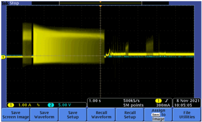
The two traces of an HDD spin-up do show some similarities in terms of timing, but the shape of the main region clearly looks very different.
The first thing to do is to understand how the two traces have been measured. In this case, we confirmed:
Customer’s Quarch Setup
-
- Quarch SFF injection fixture attached behind the drive
- 4uS sampling rate, with 1024 samples being averaged to give one power sample every 4.096mS
- Recorded in Quarch Power Studio
Customer’s Scope Setup
-
- Power resistor attached in series with the +12V signal
- 20 MHz Bandwidth probe set
- 2x voltage probes measuring the voltage drop to calculate current
- (A second setup using a current probe was used later, showing similar results)
Quarch Power Analysis
Quarch power tools come in two main ranges: the PPM (which supplies power) and the PAM (which monitors the host power). Both use simple plug-and-play fixtures for fast setup and allow capture from both Quarch Power Studio or via simple scripted automation. For more information, you can visit: https://quarch.com/solutions/power-analysis/
Sampling and Averaging
This immediately shows an issue: the Quarch trace is averaging many samples together, producing a smoother waveform. When comparing power traces, it is important to choose an appropriate averaging rate and apply it to both traces.
OCP Example
The Open Compute Platform (OCP) has specific requirements when it comes to power analysis of storage devices
One requirement is for device peak power to be measured at:
-
- 4uS base sampling rate
- Analysed with an averaging window of 100uS
Many Quarch customers have similar requirements, and while the exact rates and averaging windows may differ, the idea is the same: To produce a realistic value of power consumption for an SSD or HDD, such that different devices and workloads can be compared.
Making the comparison
We set up a Quarch Power Analysis Module and an Oscilloscope and Current probe up in parallel so we could take both measurements at the same time for comparison, setting both to similar sampling rates (as close as we could get). We used a 2-channel PAM fixture and an external ATX PSU to supply the drive, to be as close as possible to the customer setup.

The issue was the shape of the spin-up profile. If we run the Quarch tools at a similar sampling rate, we see the same profile BUT when we average this out, we can see the underlying trend is different.
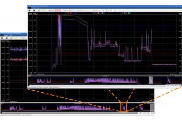
Zooming in
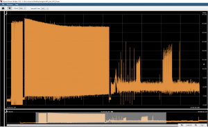
When we zoom in on the trace in Power Studio, we can see the power trace (orange) is very noisy during spin-up and jumps between around 1 and 20 watts
Let’s zoom in on the higher rate capture and look more closely:
At the start of the spin-up, we see a lower power consumption, with a few spikes up to the higher level
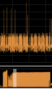
In the middle of the spin-up, we can now see larger and longer spikes

Now at the end of the spin-up period, we see that the power is mainly in the high state and only dropping intermittently to the lower level.

This explains the main difference. The high-resolution one at 4uS is showing the rapid transitions of power draw during the drive spin-up, while the 10mS capture is giving a general trend, showing that power consumption increases during the process.
Resampling the scope
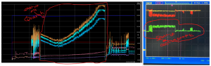
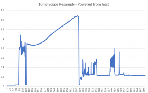
To prove the data is comparable, we downloaded the scope data to CSV (a painful process requiring a legacy USB stick and additional tools)
We then wrote a python function to resample the data to the same 10mS averaging rate as used on the Quarch tools. This was necessary, as the scope did not support sufficient internal averaging to do it internally.
This is current data, not power, but we see the same clear trends across the full spin-up period.
Conclusions
-
- It is easy to look at a trace (especially a static capture) and not be aware of the underlying details. In this case, the drive is drawing power in a modulated fashion, similar to a PWM waveform. This was not clear from a zoomed-out scope trace.
- The ability to perform windowed averaging and easy zooming is essential to understanding what the device is doing.
- Ensuring all capture sources use the same averaging window is essential if you want to make a valid comparison
- Setting up and capturing with the scope was ‘much’ harder than with the Quarch tools. It required a custom cable that the current probes could attach to, and while saving traces to a USB stick was possible, it was slow and prone to error. We ended up using a phone to take pictures of the scope screen, as it was easier! With over 20 comparisons during testing, this was a pain to track.


Andy Norrie