When you are asked to review power data (or anything similar), it always seems to come in one of two forms:
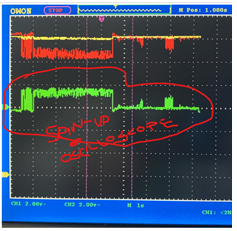 Exhibit A is the ‘scope trace’ that someone shares with you. These are often low-resolution screenshots (or mobile phone images).
It’s small and blurry, and I can’t work out what the scale is or what each trace represents! So you say you need more data, and what do you get?
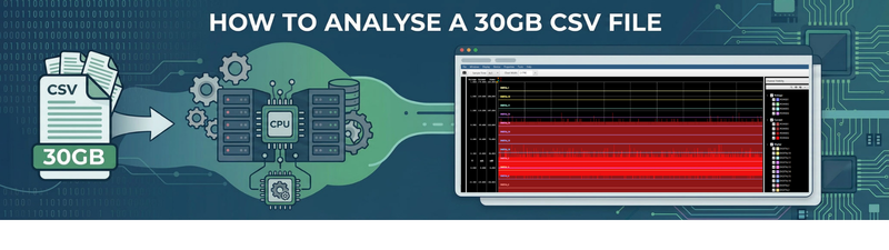
Exhibit B The monster CSV file
![]()
Almost 30GB of CSV ‘data’ that may or may not be useful. How do you even begin to work with this?
Well, first you don’t notice how big the file is, so you just go ahead and open it.
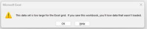
To be fair to Excel, it quickly warns you and then opens a basic preview of the first million or so rows. It’s even able to draw a basic chart of a single column fairly quickly. It grinds to a halt when trying to chart all 8 analog channels, though.
The trouble is that this represents a tiny percentage of the data. Opening the full file in Notepad++ worked fairly quickly and I can see the extent of the issue
 Excel opened 1,048,576 rows. The file contains 455,207,710 rows. That is just over 0.2% of the data! The CSV file has 8 analog traces and an additional 16 digital ones. Some of this can be discounted, as not all channels are wired up, but I really need to see everything to understand the full trace!
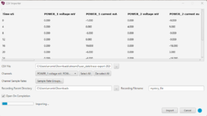
A few clicks in the new CSV import function of QPS show the data is nicely time-stamped so we can directly import it. This is not a fast process for a large file, but it only needs done once.
With the data imported, I have a vastly better overview of what is going on… and the answer is: Not a lot.
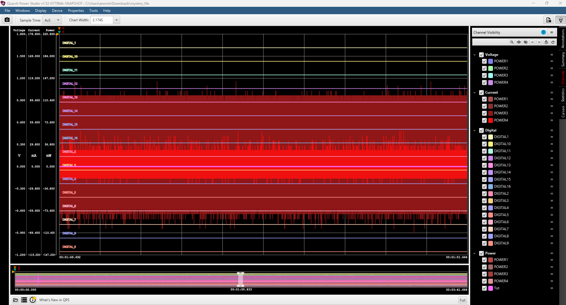
The timeline on the bottom does show a spike on the left, though; we can zoom in with a click. As the data is processed, navigation is almost instant despite the large file size.
Being able to see the full summary also allows me to hide the traces that are not changing, and we can quickly narrow down to a 1.1v spike dropping down over around 0.5 seconds.
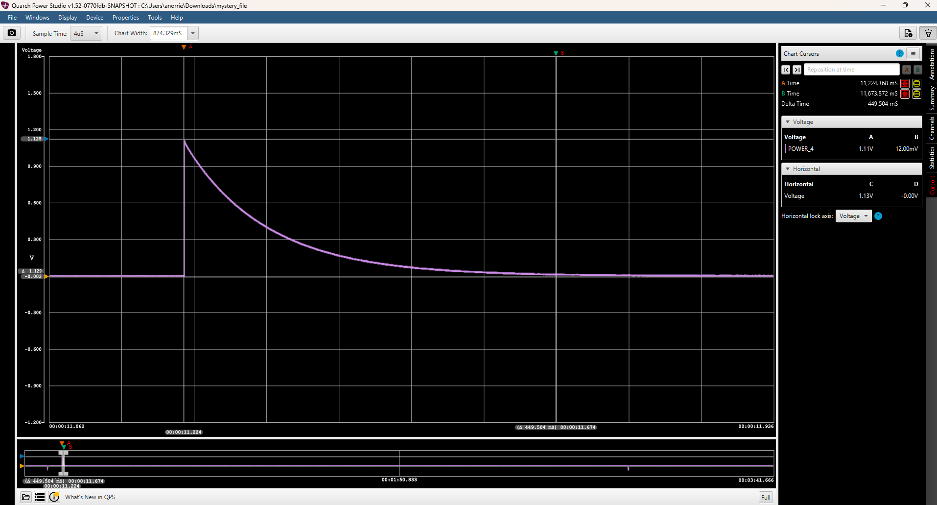
An experienced engineer can glance at a trace like this and quickly work out what it is showing. In this case, the voltage supply has not been enabled, so our device under test did nothing; all we see is this spike when the power switches inside the analyser close to trying to turn it on! An experienced engineer can examine a trace like this and swiftly deduce its implications. In this particular instance, the voltage supply has not been activated, resulting in our device under test remaining inactive. Consequently, the only observable phenomenon is this spike that occurs when the power switches within the analyser attempt to engage the device. This spike serves as a clear indicator of the power transition, highlighting the moment when the analyser tries to initiate the device, even though it ultimately does not perform any functions due to the lack of a power supply. Understanding this context is crucial for troubleshooting and ensuring that the setup is correctly configured for future tests.
At least we can work this out quickly and can go and correct the setup. Trying to debug the issue from the raw CSV would have taken far more time.
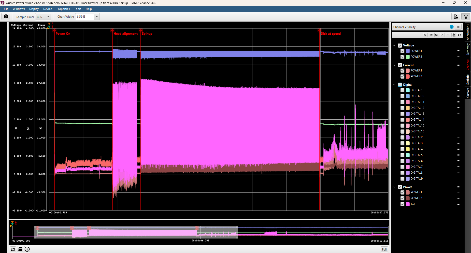
A little while later, we have the data we needed. Here we have trimmed the trace to the power event we were interested in. We’ve also added annotations to better explain what is happening.
With the CSV import feature, you can take data from almost any source. This allows you to analyse data from your own processing scripts or even from other manufacturers’ instruments.
Provided the data is numeric and has appropriate column headers and a timestamp, we can work with it. This allows fast navigation and zooming, cursor measurement, statistics calculations, adding annotations, and exporting smaller subsections of the file.

Andy Norrie